Sign-up optimization
Redesigning the sign-up flow to increase conversion for self-serve customers
UI Design | UX Design | User Research | User Testing
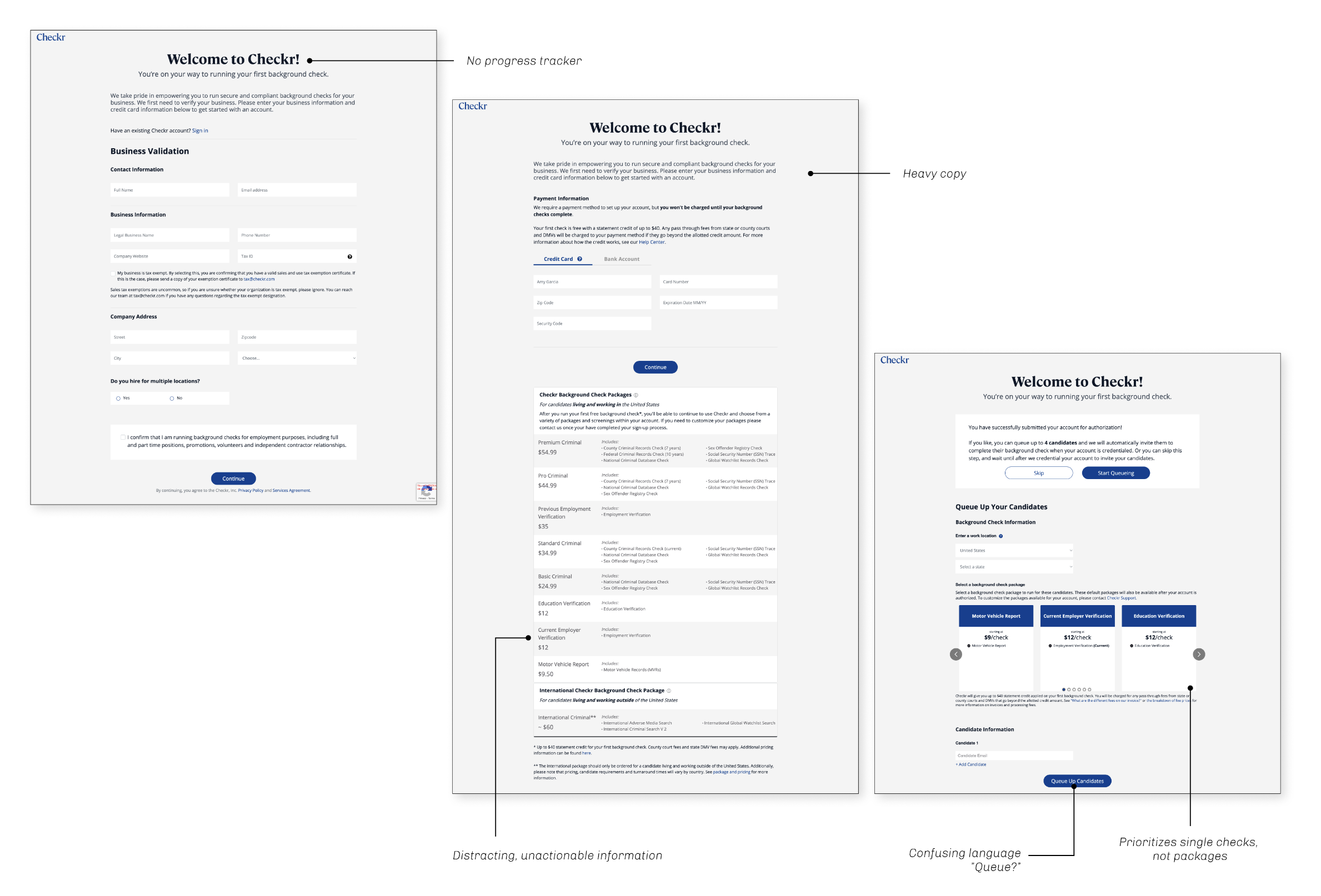
One of Checkr’s recent user-centric priorities was to transform our product to be more self-service. Checkr dedicated a lot of resources towards this revolution including revisiting the sign-up flow. There were many areas of opportunity for this sign-up flow:
Only 3% of self-serve customers run Motor Vehicle Record (MVR) checks
26.6% funnel drop-off
Overwhelming display of information
Lack of visibility of system status
Original state
The biggest drop-off (-21.4%) occurs between collecting payment information and ordering a check. Understanding this drop-off allows us to better understand where a design intervention needs to happen.
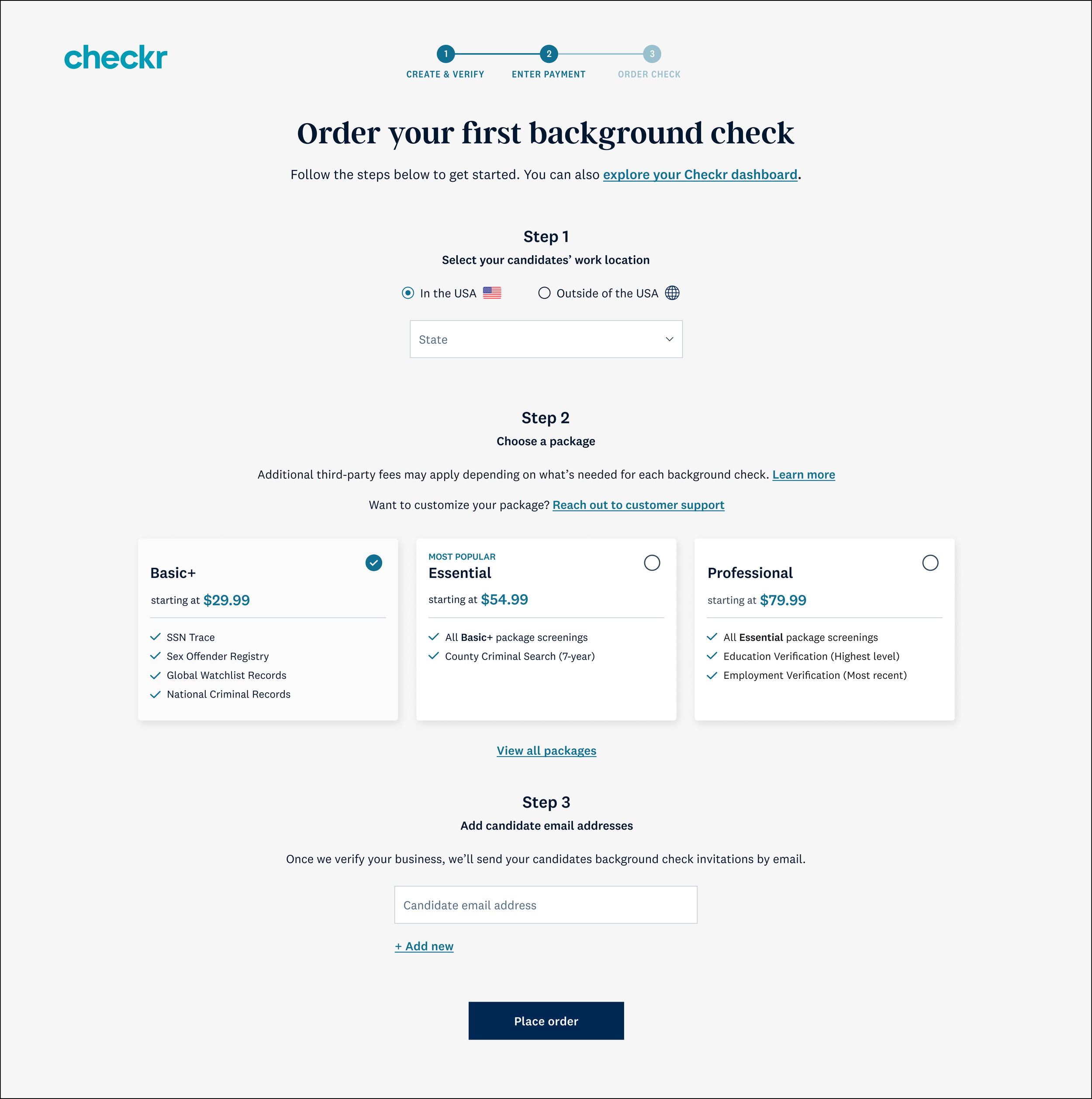
These designs aim to increase overall conversion, encourage more customers to complete the order and increase overall order size with add-ons.
Research
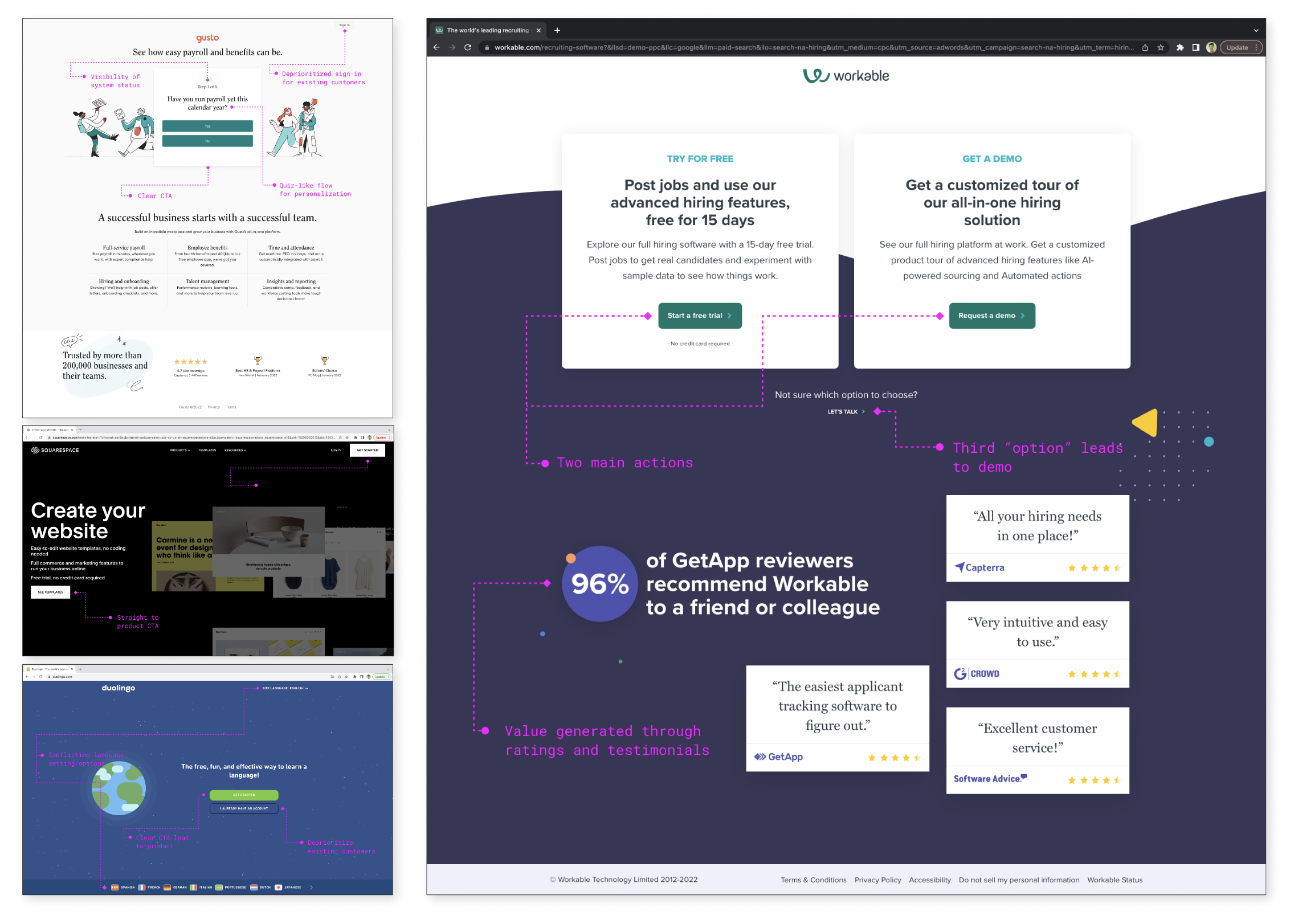
A thorough comparative analysis of adjacent products’ sign-up flows allowed our teams to better understand how to drive conversion. The products looked at were:
Duolingo
Gusto
AirBnB
Squarespace
Workable
These comparative analyses informed some changes to the proposed customer journey map and content present on each page. The following insights were informed changes to the sign-up flow:
Overlapping flows — Overlapping the sign-up process and core product with onboarding allows for a contiguous process that isn’t jarring or isolated from one another
Value generation — Personalization, ratings, and reviews function as a form of value in lieu of teasers and demos
Small user tasks — Successful flows request user information when it is necessary rather than collecting a bulk of information upfront, splitting up user inputs into smaller tasks
Solution
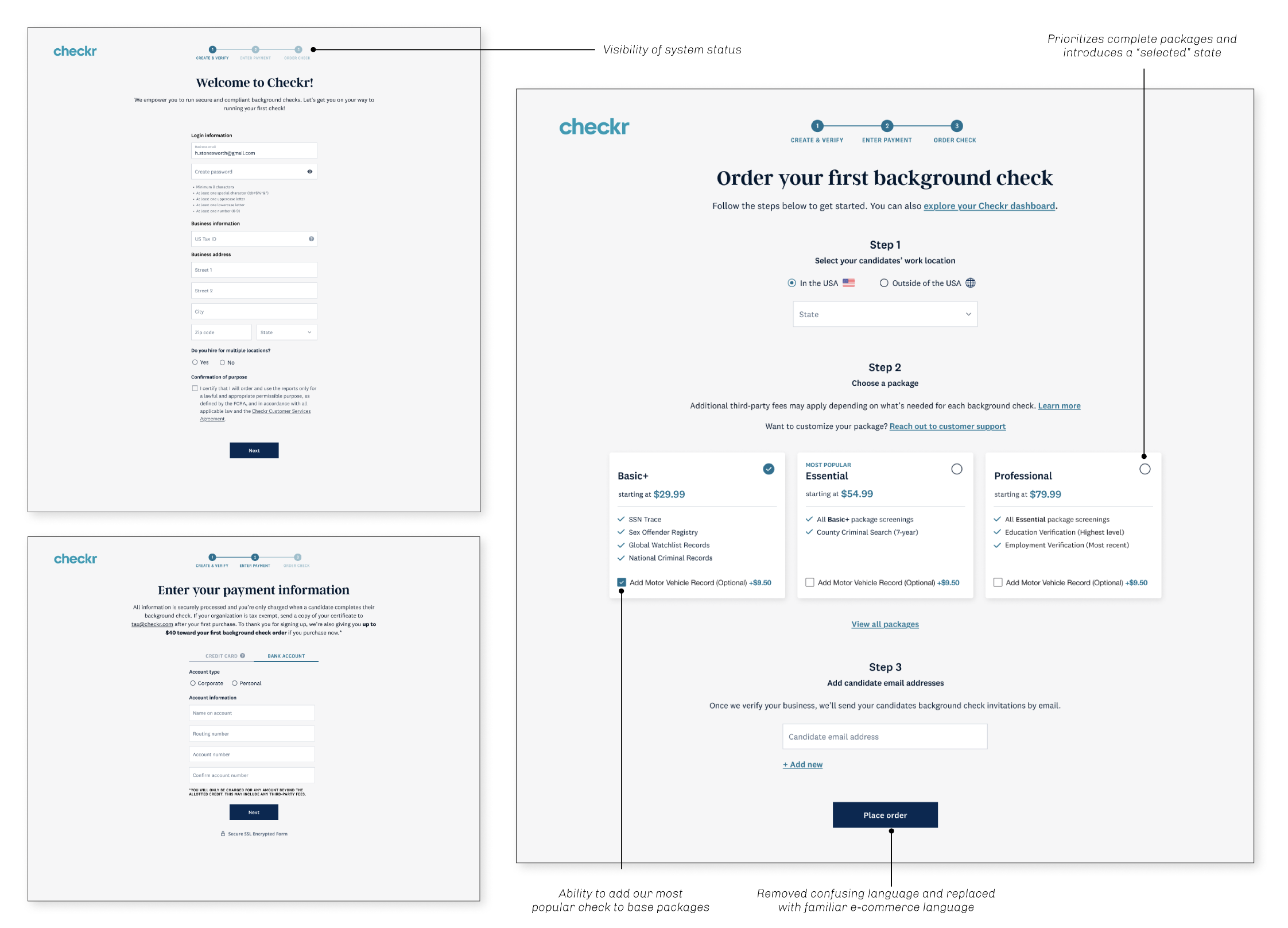
When designing the solution, it was important for me to isolate the most necessary information needed to create the most effortless experience for our users. This allowed me to cut back on the overall content and fields requested. Some major changes included:
Reducing copy at the top of the page, therefore reducing overall scrolling
Removing unnecessary, distracting content
Prioritizing complete packages over standalone checks
Direct CTAs that lead straight into the core product
Optimization impact
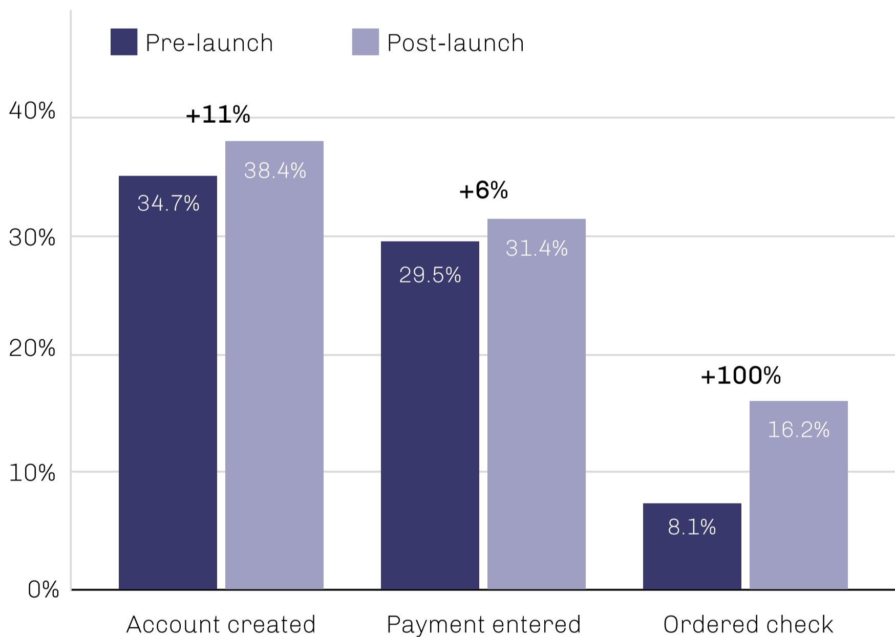
Figure 2 — Conversion rates of sign-up flow
All metrics increased after thirty days of launching the optimized sign-up experience. There was an overall increase in activation rates. This project was able to:
Increase conversion across our funnels, double the amount of users completing the final funnel (see figure 2)
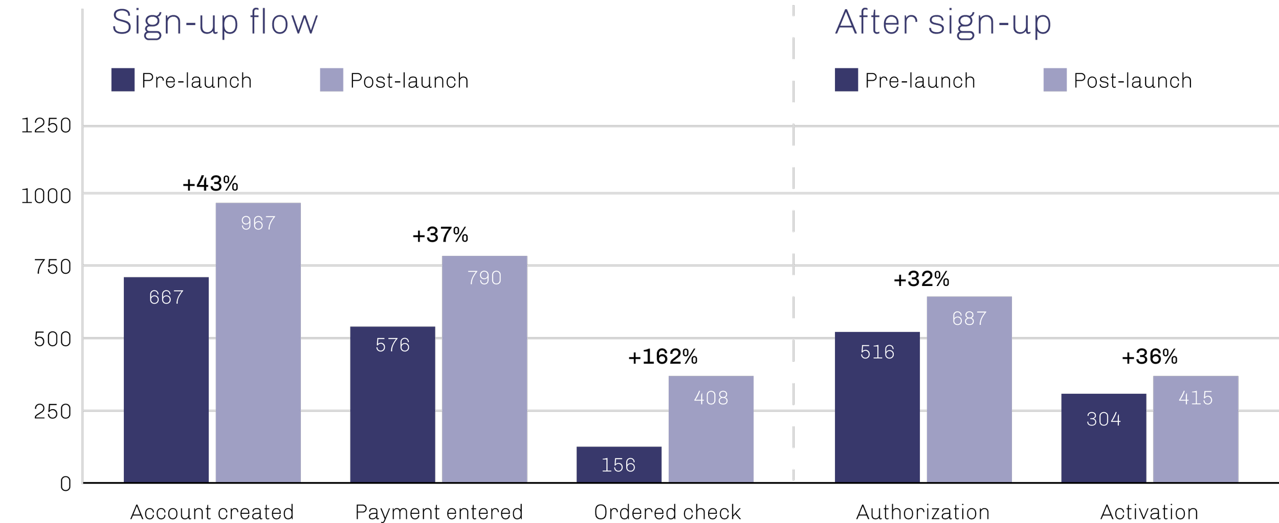
Positively influence conversion beyond sign-up flow positively impacting (see figure 3)
Significantly, positively impact all metrics regarding MVR add-ons including reducing the time it takes to order the first MVR after account creation (see table 1)
Figure 3 — Average weekly number of customers completing each step
Table 1 — Overall MVR add-on performance


